A Beginner's Guide to Mobile First Web Design and Responsive Website Design
There are well over 1 billion websites in the world. But not all websites are equal.
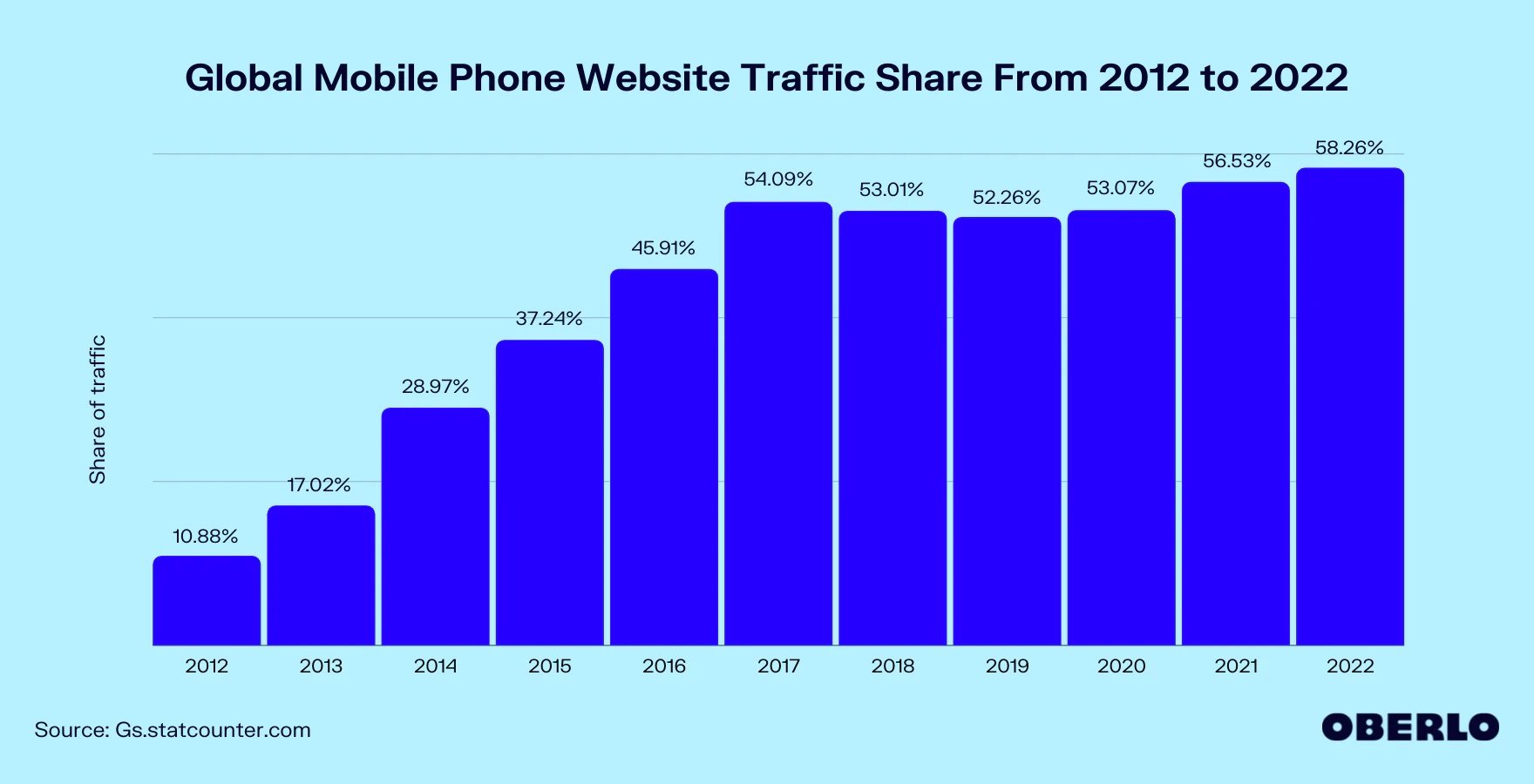
76% of the top websites are mobile-friendly. And with more than half of all web traffic coming through mobile phones, it’s easy to see why.
However, people still access websites on various devices, from desktop computers to smartphones to tablets. For this reason, your website needs to work well across all devices.
In this beginner-friendly guide to mobile web design, we'll cover everything you need to know about making sure your website looks great on all screens.
Let's dive in.
What is responsive website design?
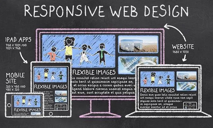
Responsive website design is a technique that allows you to create a website that uses fluid layouts and flexible images so your website always looks great on any device. Responsive web design differs from other types of web design because it's mobile first instead of desktop first.
Your customers need to easily access your content no matter where they are or what device they're using — and responsive design makes this possible.
 (
(Responsive websites are:
- Easy-to-use and navigate
- Load instantly on any internet connection speed
- Compatible with all devices
What is the difference between responsive web design and mobile first web design?
Responsive web design is a technique that allows you to design a website for viewing on any device. It uses CSS media queries to adjust the page layout depending on its viewport width — the size of the browser window displaying your content.
On the other hand, mobile first web design focuses on designing for mobile first. When building your site using this technique, you make sure it's as fast and easy to use as possible by optimizing your site for mobile devices first; then you focus on other design elements from there.
Responsive web design (RWD) is a subset of mobile first web design (MFWD).
5 reasons responsive website design is important
Mobile devices have become more prevalent than ever in the past decade.
As a result, it makes perfect sense to optimize your website for every device that your visitors are using so you can provide them with an optimal customer experience.
Improve user experience
Your website's purpose is to help your visitors accomplish their goals — the more quickly, easily, and intently they can do so, the better.
If your site isn't responsive, it'll be harder for your visitors to read and navigate.
If a visitor has trouble finding what they're looking for on your site, then this will likely cause them to leave without completing their task — and that's bad news for business.
Imagine a hungry customer looking to order food online. If they don’t find a responsive restaurant website that allows them to browse the menu and place an order on any device, they’ll move on to the competition.
Increase traffic
Responsive web design is important for increasing your site's traffic.
More people are using mobile devices to access the internet than ever before.
It’s essential to keep up with the growing trends to meet your consumers' wants and needs.
Lower bounce rate
Bounce rate is a metric that tracks the percentage of visitors who leave your website after viewing only one page.
Measuring how many people are engaging with your site is important to track because it can provide insights about how well your website is performing.
If you have high bounce rates, it can indicate something's wrong with your site — visitors aren't finding what they're looking for, are frustrated with the layout, or the load time is taking too long.
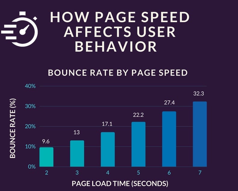
In short, a high bounce rate indicates that you're not providing users with the experience they want, which can lead to missed opportunities.
However, if you have an effective, responsive design in place and can deliver on your user's expectations from multiple devices, you'll be able to lower bounce rates significantly.
Improve search engine rankings
Google has a mobile-friendly algorithm that places more emphasis on websites optimized for mobile use.
How often do you navigate to the tenth page of Google? Probably never.
A higher ranking on Google drives more traffic to your website.
Higher return on investment
A responsive website can save you money in the long run.
It requires less development time and costs less money than creating multiple websites for different devices and browsers.
A properly designed responsive website can lead to higher conversion rates on mobile devices, meaning it'll drive sales better than an outdated or non-responsive site.
How to create a responsive mobile web design
At this point, it’s clear that a mobile-friendly website is a must-have for your business.
But how do you go about creating one for yourself?
Fortunately for you — and your customers — you don't have to be a principal coder to build a mobile web design optimized for every device and screen size.
There are many options for designing a website.
You can outsource your project to a website design agency. Of course, agencies charge a pretty penny, and a simple website design can cost thousands of dollars. Ouch.
Or you can take the more economical approach and simply choose the best website builder according to your needs. What a relief.
When creating a responsive website design, think about what kind of experience you want visitors to have on your site and how mobile devices fit into that equation.
Here are some questions you should ask yourself:
- Who's my audience?
- How do they use mobile devices?
- What are their pain points when browsing on their phones or tablets?
- What are their goals?
- Do they need help finding something on my website or want to make a purchase?
Once you have the answers to these questions, you are off to the races. Time to get your creative cap on and design the website of your dreams.
10 best practices for mobile web design
A mobile-friendly website is a great way to make sure that your users have an enjoyable experience.
Here are ten best practices to keep in mind for mobile first web design.
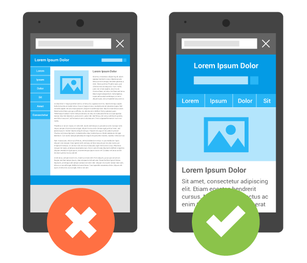
Use a single-column layout
Due to the smaller screen size of smartphones and tablets, users need to be able to quickly scan through content and find what they're looking for within seconds.
Using single-column layouts will allow them to do just that.
Don't block JavaScript, CSS, and image files
By default, some browsers block any file served from a different domain than the page itself.
Blocked files have a negative consequence for your users and may cause the page to load slowly or not at all.
To avoid this problem, you should always allow cross-domain requests for those three types of files:
- JavaScript: *.js
- CSS: *.css
- Images: *.jpg/.png/.gif
Set content to viewport
To make your content look great on mobile devices, set the viewport to the device's size. You can use CSS, media queries, or set a viewport meta tag.
The viewport meta tag tells the browser how to display content in its initial rendering. This helps make sure that users don't see an ugly mobile site on their desktop computer.
For this to work properly, you need to set both the initial and maximum scales equal to 1 (or 100%). That way, users won't break anything when they zoom in or out, and everything will scale accordingly.
Size tap targets appropriately
The target size should be large enough to allow for ease of use, but not so large that it’s unplayable.
Aim for about 7x7 pixels for buttons, 9x9 pixels for menus, and 11x11 pixels for content areas.
Avoid unplayable content
Make sure your site plays nicely on mobile by:
- Using HTML5 instead of Flash
- Avoiding any content that requires plugins
Optimize and minify CSS/JavaScript
Use as few files as possible to avoid slowing down page loads.
Optimize and minify the CSS/JavaScript in your pages so they download faster than they would otherwise by using tools such as "minification."
Minifying refers to removing all unnecessary characters from a file, like whitespace or comments, which makes it smaller and less bulky in size.
Minimize round-trip times (RTTs)
The round-trip time (RTT) is the time it takes for a request to travel from your browser to a web server and back again.
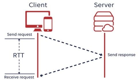
The lower the number, the faster your site will feel to users. Ideally, you want an RTT of less than 100 milliseconds.
Enable compression
Compression is a great way to reduce the file size of your web pages, improving the speed at which they load.
Compression is possible thanks to HTML5, which allows you to specify an audio or video code used for playback on mobile devices.
Images are a critical aspect of any website.
They're also the heaviest aspect to load on a website.
To reduce page weight and improve site performance, you'll want to optimize all of your images by using the right file format for each image type:
- .jpg for an image
- .gif for an animation
- .png for transparency in text overlays or avatars
- .svg for scalable vector graphics
Use a content delivery network
The main function of a content delivery network (CDN) is to distribute content.
A CDN can also help speed up your site's load times and reduce server load.
Wrapping up
Developing a mobile web design and responsive website from scratch sounds intimating, time-consuming, and requiring expert knowledge of modern web development.
Thankfully, most SaaS website builders automatically optimize a mobile version of your website. And you don’t even have to lift a finger or spend additional money.
So get started today and reap the benefits.
Providing your visitors with an excellent mobile experience will boost your website traffic and drive long-term business growth.